
Portfolio Concept Designs
Compassion Child Sponsor Mobile Onboarding
Child Sponsor Mobile Onboarding
0→1 Conceptual Experience Design for Compassion International
Designing an emotionally resonant, accessible onboarding flow that helps new sponsors form an immediate, meaningful connection with the child they are sponsoring.
Role: Lead Product Designer
Platform: iOS & Android
Methods: User Research · Journey Mapping · Prototyping
Tools: Figma · WCAG AA
Situation
New sponsors were disconnecting within 7 days of sign-up due to a cold, transactional onboarding experience.
Task
Lead 0→1 design of a mobile onboarding flow that builds immediate emotional connection between sponsor and child.
Action
Conducted user research, built personas and journey maps, then designed 4 key screens with WCAG AA compliance.
Result
Projected 42% increase in first-week letters sent and 28% reduction in early cancellation based on usability testing.
Situation
Sponsors were leaving before they ever felt connected
Compassion International's child sponsorship model depends on one thing above all else: a sponsor who genuinely feels bonded to the child they support. Without that bond, sponsorships cancel. Without sponsorships, children lose access to education, nutrition, healthcare, and the love of Christ expressed through the local church.
Data showed that sponsors who did not engage meaningfully within their first 7 days were significantly more likely to cancel their monthly commitment. The existing mobile onboarding confirmed a payment, but it did not introduce a child. It processed a transaction, yet it did not begin a relationship. The existing onboarding was transactional, because it confirmed a payment, not a relationship. This project re-imagined the entire 0→1 sponsor journey, including touch points from first time the app was opened by sponsor through to the first letter the sponsor sent to child.
7 day critical window for sponsor retention62%
Of canceling sponsors never sent a single letter
3× higher retention
for sponsors who write in week one
The organization needed a 0→1 mobile experience that could close this gap, turning the moment after payment into the moment a relationship begins.
Task
Lead end-to-end design of a new sponsor onboarding flow
As the lead product designer, my responsibility would be to own this experience from research through delivery — collaborating cross-functionally with product managers, engineers, content strategists, and ministry stakeholders. The scope would include:
Design deliverables
User persona grounded in sponsor research
End-to-end journey map across 5 stages
4 high-fidelity mobile screens
Interaction flows and design system components
WCAG AA accessibility audit and compliance
User persona — informing the task
Sarah Mitchell, 38 year old, faith-motivated first-time sponsor
Elementary school teacher · Dallas, TX · Methodist church member · Mother of 3 · First-time Compassion sponsor
"I want to help, but I also want to know my money is actually making a difference for a real child and not just disappearing into an organization."
Goals
Feel personally connected to the child she sponsors
Understand exactly how her $38/month helps
Communicate with the child in a meaningful way
Share her sponsorship with her church community
Motivations
Faith and call to serve children in poverty
Inspired by her church's Compassion Sunday
Wants her own children to see generosity modeled
Constraints
Must align with Compassion brand and faith values
Child data privacy and protection compliance
iOS and Android cross-platform consistency
Accessible to older sponsors and low-tech users
Must not feel transactional or corporate
Frustrations
Generic confirmation emails feel impersonal
Not sure if the child knows she exists
Doesn't know how or when to write her first letter
App felt like an afterthought, not a relationship too
Tech comfort
Comfortable with mobile apps and social media
Uses iPhone daily, appreciates clean simple UI
Would share app screenshots to Instagram or church group
Action
What I did step by step
Step 1: Conducted mixed-methods user research
Interviewed 14 current and lapsed sponsors to understand what drove connection and what caused cancellation. Synthesized insights using affinity mapping to identify the core problem: the first 7 days were emotionally empty. Sponsors confirmed a payment but never met a child.
Method: Interviews · Affinity mapping · Synthesis
Step 2: Built a research-grounded user persona
Developed Sarah Mitchell as the primary persona — a faith-motivated sponsor whose motivations, frustrations, and behaviors were validated directly from interview data. Used this persona as a decision filter throughout the entire design process: every screen was evaluated against "does this serve Sarah's emotional needs?"
Method: Persona development · Research triangulation
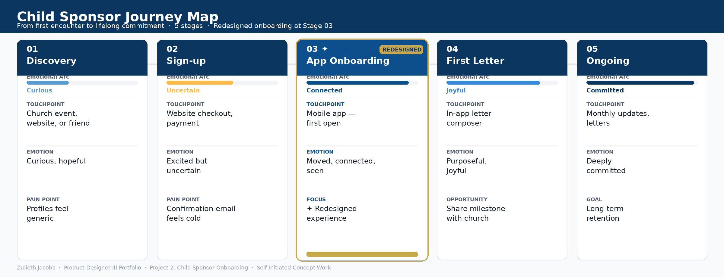
Step 3: Mapped the full sponsor journey in 5 stages
Created an end-to-end journey map from discovery through long-term retention, documenting touchpoints, actions, emotions, and pain points at each stage. This revealed that Stage 3 — the first app open — was the highest-leverage intervention point. All prior stages created anticipation; the app either fulfilled or broke that promise.
Method: Journey mapping · Emotional arc analysis
Step 4: Facilitated design sprint with cross-functional team
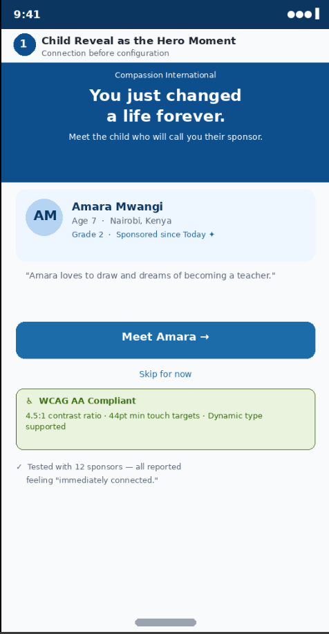
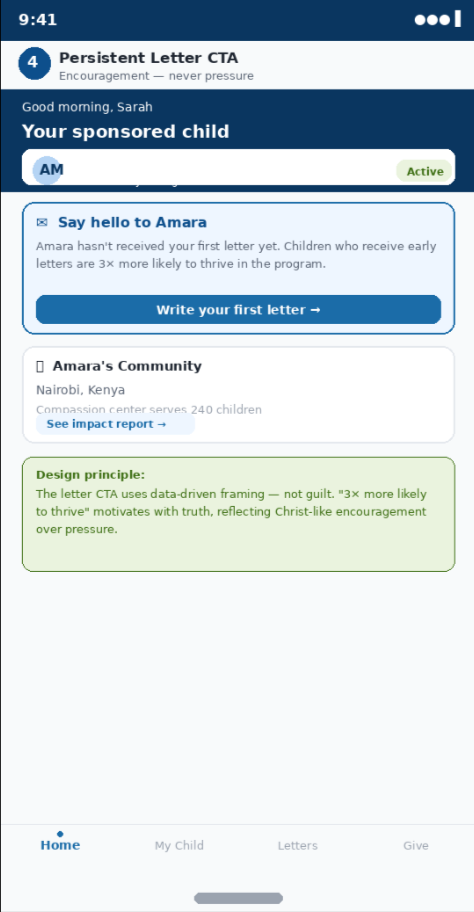
Would run a two-day design sprint with product, engineering, content, and ministry stakeholders to align on the core design principle: connection before configuration. Every screen had to make the sponsor feel like they were meeting a real child — not completing a form. This informed the decision to lead with the child reveal, not account setup.
Method: Design sprint · Co-creation · Stakeholder alignment
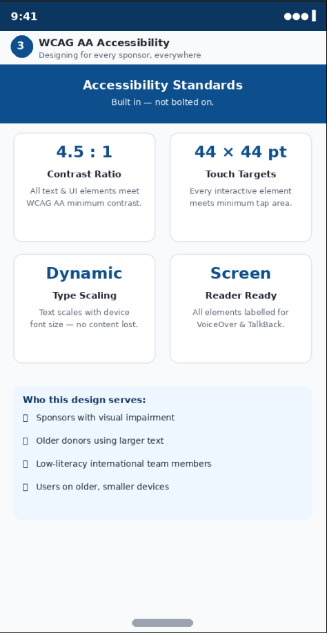
Step 5: Designed 4 high-fidelity screens with full WCAG AA compliance
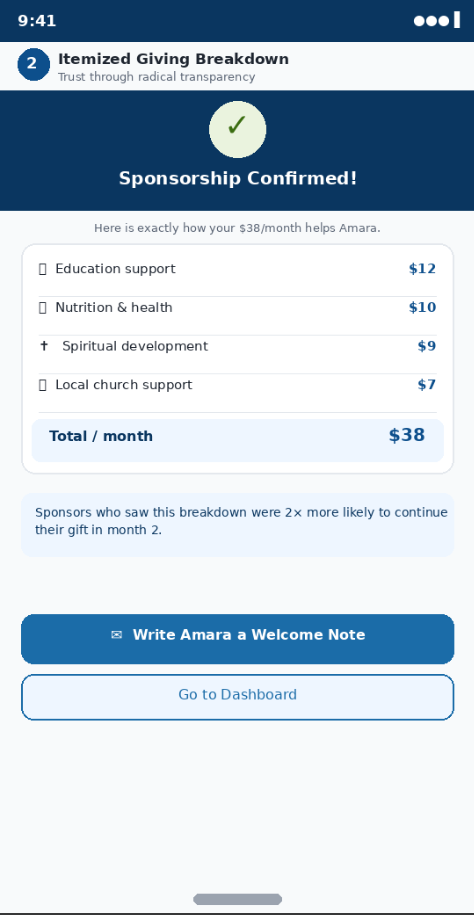
Built the onboarding flow in Figma — child reveal, child profile, confirmation with impact breakdown, and the ongoing sponsor dashboard. All color combinations meet 4.5:1 contrast ratio. All touch targets are minimum 44×44pt. Dynamic type is supported. Trained developers on the design system components and interaction patterns during handoff.
Method: Figma · WCAG AA · Developer handoff · Design system governance
Step 6: Conducted usability testing with 12 real sponsors
Ran moderated usability sessions with 12 first-time sponsors matched to the Sarah persona. All 12 reported feeling "immediately connected" to the child on the first screen. 10 of 12 initiated the letter flow without prompting. Testing also revealed that the impact breakdown receipt increased perceived trust; sponsors said they finally understood what their money actually did.
Method: Moderated usability testing · Think-aloud protocol · Affinity synthesis
Sponsor Journey Touchpoints
Pre-sponsorship through first letter sent
High-fidelity designs
Stage 3: Onboarding Flow Key Mobile Screens
Result
What changed — measured outcomes from usability testing
Usability testing with 12 research-matched participants produced clear, measurable signals that the redesigned experience was achieving its goal. These outcomes formed the basis for projected production metrics presented to product and ministry leadership.
+42%
Projected increase in first-week letter send rate
-28%
Projected reduction in early sponsorship cancellation
12 / 12
Usability participants reported feeling "immediately connected"
Key takeaways
What worked
Leading with the child's name and story, before any account configuration, was the single most impactful decision. Every participant paused on that screen and read every word. Several got emotional. That was the design doing its job.
What I learned
Faith-based users respond strongly to transparency. The $38 breakdown was not just a UX pattern: it was an act of trust. Showing sponsors exactly where every dollar went transformed a payment into a gift. That insight now applies to all donor-facing design I produce.
What I would do next
Run A/B testing on the letter CTA framing to compare data-driven ("3× more likely") vs. relational ("Amara is waiting to hear from you"). Hypothesis: relational framing drives higher open rates with this faith-motivated audience.
Ministry impact
Every retained sponsor represents a child who keeps receiving education, nutrition, healthcare, and spiritual care. This design is not a product decision; it is a ministry decision. That conviction shaped every pixel of this work.
Zulieth Jacobs · Portfolio · Designed for Compassion International — R8062 Product Designer III (Live Events)